LogoMkSaaS Docs

Themes

Learn how to customize the themes in your MkSaaS website

This guide covers the theme system in your MkSaaS website, how to switch between built-in themes, and how to create and customize your own themes.

Core Features

The MkSaaS template comes with a built-in theme system that allows users to customize the appearance of the website. The theme system includes:

  • Light and dark mode support
  • Multiple color themes (default, neutral, blue, green, amber)
  • Theme switching functionality for users
  • Theme persistence with cookies

Built-in Themes

The template includes several pre-configured themes that you can use out of the box.

Available Themes

The following themes are available by default:

  • Default: The main theme with a balanced color palette
  • Neutral: A grayscale theme with neutral colors
  • Blue: A theme with blue as the primary color
  • Green: A theme with green as the primary color
  • Amber: A theme with amber as the primary color

Each theme changes the primary color and related colors while maintaining the overall design system.

Theme Configuration

The theme system is configured in the website.tsx configuration file.

src/config/website.tsx
export const websiteConfig: WebsiteConfig = {
  metadata: {
    theme: {
      defaultTheme: 'default', // Choose from: default, blue, green, amber, neutral
      enableSwitch: true,      // Enable/disable theme switching
    },
    // ...other configuration
  },
  // ...rest of config
};

Configuration Options:

PropertyTypeDescription
defaultTheme'default' | 'blue' | 'green' | 'amber' | 'neutral'Sets the default color theme for the website
enableSwitchbooleanWhen true, allows users to change the color theme

How Theme Switching Works

The theme switching functionality is implemented through several key components:

1. Theme Provider

The ActiveThemeProvider component in src/components/layout/active-theme-provider.tsx manages the current theme state and persists it using cookies:

src/components/layout/active-theme-provider.tsx
// Key functionality of the ActiveThemeProvider
export function ActiveThemeProvider({
  children,
  initialTheme,
}: {
  children: ReactNode;
  initialTheme?: string;
}) {
  const [activeTheme, setActiveTheme] = useState<string>(
    () => initialTheme || DEFAULT_THEME
  );
 
  useEffect(() => {
    // Save theme to cookie
    setThemeCookie(activeTheme);
 
    // Apply theme class to body
    Array.from(document.body.classList)
      .filter((className) => className.startsWith('theme-'))
      .forEach((className) => {
        document.body.classList.remove(className);
      });
    document.body.classList.add(`theme-${activeTheme}`);
  }, [activeTheme]);
 
  // ...rest of component
}

2. Theme Selector Component

The ThemeSelector component in src/components/layout/theme-selector.tsx provides the UI for users to switch between themes:

src/components/layout/theme-selector.tsx
export function ThemeSelector() {
  if (!websiteConfig.metadata.theme?.enableSwitch) {
    return null;
  }
 
  const { activeTheme, setActiveTheme } = useThemeConfig();
  const t = useTranslations('Common.theme');
 
  // Theme options
  const DEFAULT_THEMES = [
    {
      name: t('default'),
      value: 'default',
    },
    // ...other themes
  ];
 
  // ...component rendering
}

3. CSS Implementation

The themes are defined in the global CSS file (src/styles/globals.css) using CSS variables and Tailwind CSS:

src/styles/globals.css
/* Base theme variables defined in :root */
:root {
  --radius: 0.5rem;
  --background: oklch(1 0 0);
  --foreground: oklch(0.141 0.005 285.823);
  /* ...other variables */
}
 
/* Dark mode overrides */
.dark {
  --background: oklch(0.141 0.005 285.823);
  --foreground: oklch(0.985 0 0);
  /* ...other variables */
}
 
/* Theme-specific overrides */
.theme-default {
  /* default theme */
}
 
.theme-neutral {
  --primary: var(--color-neutral-600);
  --primary-foreground: var(--color-neutral-50);
 
  @variant dark {
    --primary: var(--color-neutral-500);
    --primary-foreground: var(--color-neutral-50);
  }
}
 
/* ...other themes */

Creating Custom Themes

You can create your own custom themes by adding new theme definitions to the global CSS file.

1. Add a New Theme Class

Add a new theme class to src/styles/globals.css:

src/styles/globals.css
.theme-custom {
  --primary: var(--color-purple-600);
  --primary-foreground: var(--color-purple-50);
  
  @variant dark {
    --primary: var(--color-purple-500);
    --primary-foreground: var(--color-purple-50);
  }
}

2. Add the Theme to the Selector

Modify the ThemeSelector component in src/components/layout/theme-selector.tsx to include your new theme:

src/components/layout/theme-selector.tsx
const DEFAULT_THEMES = [
  {
    name: t('default'),
    value: 'default',
  },
  // ...existing themes
  {
    name: t('custom'),
    value: 'custom',
  },
];

3. Add the Translation Key

Add a new translation key for your theme in your translation files.

{
  "Common": {
    "theme": {
      "custom": "Custom Theme"
    }
  }
}

Advanced Customization

For more advanced theme customization, you can modify the base theme variables.

Customizing the Base Theme

The base theme variables are defined in the :root selector in src/styles/globals.css. You can modify these variables to change the default appearance across all themes:

src/styles/globals.css
:root {
  --radius: 0.5rem;
  --background: oklch(1 0 0);
  --foreground: oklch(0.141 0.005 285.823);
  /* Modify other variables as needed */
}
 
.dark {
  --background: oklch(0.141 0.005 285.823);
  --foreground: oklch(0.985 0 0);
  /* Modify dark mode variables as needed */
}

Creating a Custom Color Palette

You can create a completely custom color palette by overriding all color variables in your theme class:

src/styles/globals.css
.theme-custom {
  --background: oklch(0.98 0.01 280);
  --foreground: oklch(0.2 0.01 280);
  --card: oklch(0.97 0.01 280);
  --card-foreground: oklch(0.2 0.01 280);
  /* Override all other color variables */
}

Theme Generators

You can use the following theme generators to create your own custom themes, and then copy the CSS variables to your globals.css file.

This screenshot shows the default theme is now the custom theme.
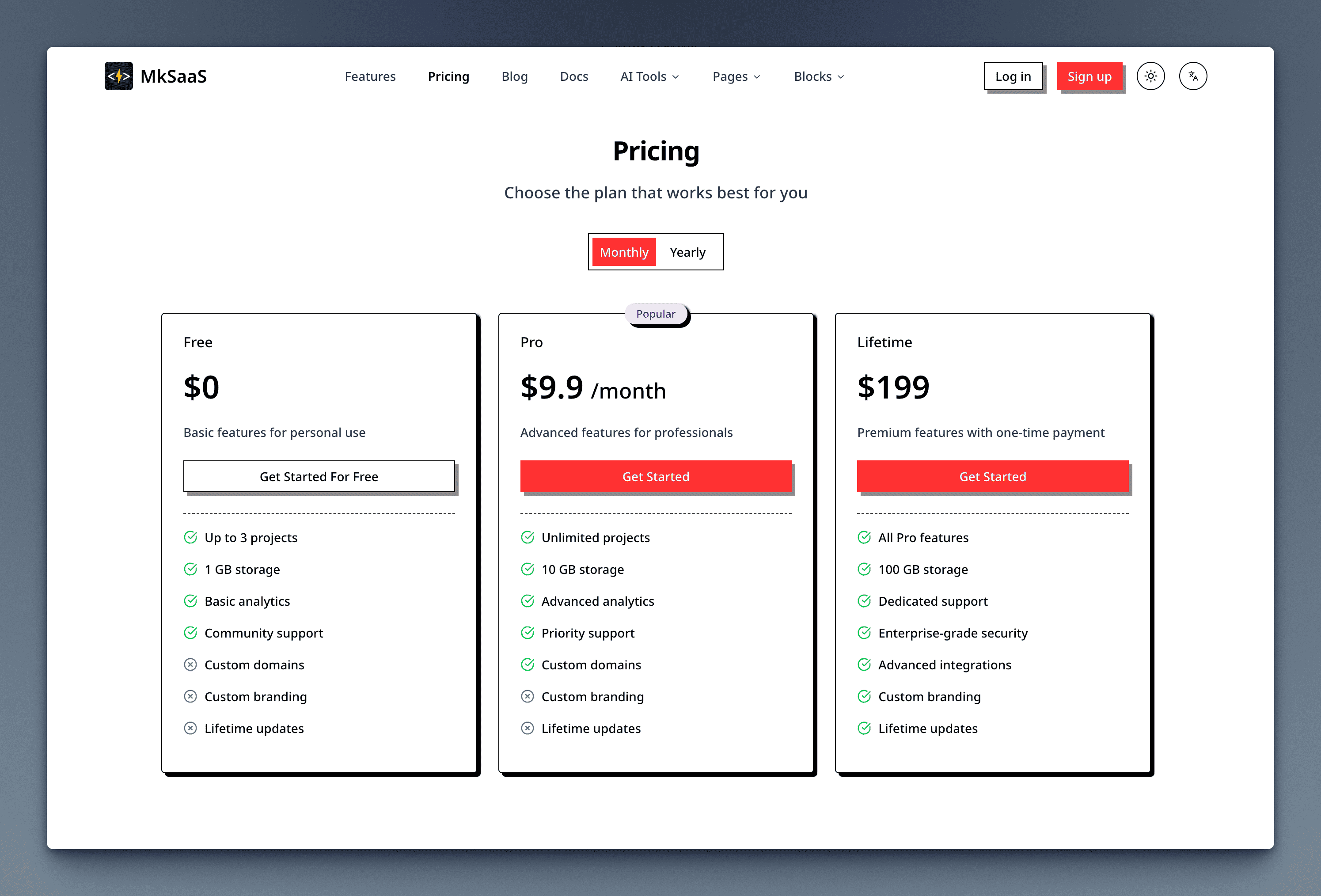
Custom Theme

Troubleshooting

Theme Not Applying

If your theme is not applying correctly:

  1. Check that the theme class is correctly defined in globals.css
  2. Verify that the theme selector is enabled in website configuration
  3. Check browser console for any JavaScript errors
  4. Clear browser cookies and reload the page

Custom Theme Flashing on Page Load

If you see a flash of the default theme before your custom theme loads:

  1. Set your custom theme as the default theme in website.tsx
  2. Use a loading state or skeleton UI while the theme loads
  3. Consider implementing server-side rendering for the initial theme

For server-side rendering, modify your layout component to pass the initial theme from cookies to the ActiveThemeProvider.

Best Practices

  • Color Contrast: Ensure that text colors have sufficient contrast with background colors for accessibility
  • Test Both Modes: Always test your themes in both light and dark modes
  • Limit Theme Options: Offer a small selection of well-designed themes rather than many similar options
  • Theme Consistency: Maintain consistent styling across different themes to avoid UI surprises

Next Steps

Now that you understand how to work with themes in MkSaaS, explore these related topics: