 MkSaaS Docs
Components
Learn about the components available in MkSaaS and how to use them effectively
MkSaaS includes a collection of UI components organized into different categories. The components are structured to maintain consistency and ease of updates.
Component Structure
The components in MkSaaS are organized into several key directories:
Registry Directory
MkSaaS uses the Components.json file to centrally manage the registration information of all UI component libraries, making it easy to add, upgrade, and track components.
Adding New Component Collections
You can find all the Shadcn/ui Components Reigstry Directory and add components from other UI libraries.
Shadcn/ui Components
Located in the src/components/ui directory, these are the foundational components from shadcn/ui. This directory contains base components that serve as building blocks for your application.
Some tips for using the Shadcn/ui components:
- Do not modify components in the
src/components/uidirectory. - Any modifications may cause conflicts during sync your codebase with the template.
- These components are regularly synchronized with the official shadcn/ui releases.
- The
src/components/uidirectory is excluded from Biome linting and formatting.
Available Components
The src/components/ui directory includes:
| Category | Components | Description |
|---|---|---|
| Form | Input | Text input field |
| Textarea | Multi-line text input | |
| Select | Dropdown selection | |
| Checkbox | Single checkbox input | |
| Radio Group | Radio button group | |
| Switch | Toggle switch | |
| Form | Form validation and handling | |
| Input OTP | One-time password input | |
| Input Group | Input with icons, buttons, labels and more | |
| Field | One component. All your forms | |
| Dialog | Dialog | Modal dialog |
| Alert Dialog | Alert confirmation | |
| Sheet | Slide-out dialog | |
| Drawer | Slide-out panel | |
| Popover | Floating content | |
| Hover Card | Hover content card | |
| Navigation | Tabs | Tabbed interface |
| Navigation Menu | Navigation menu | |
| Breadcrumb | Breadcrumb navigation | |
| Menubar | Menu bar navigation | |
| Pagination | Page navigation | |
| Data Display | Table | Data table |
| Card | Content card | |
| Calendar | Date picker | |
| Carousel | Image carousel | |
| Avatar | User avatar | |
| Badge | Status badge | |
| Layout | Accordion | Collapsible sections |
| Collapsible | Toggle content | |
| Separator | Visual separator | |
| Aspect Ratio | Maintain aspect ratio | |
| Scroll Area | Custom scrollbar | |
| Resizable | Resizable panels | |
| Feedback | Alert | Status alert |
| Progress | Progress indicator | |
| Skeleton | Loading placeholder | |
| Toast | Toast notification | |
| Sonner | Toast manager | |
| Command | Command palette | |
| Spinner | Loading state indicator | |
| Interactive Elements | Button Group | A group of buttons for actions and split buttons |
| Kbd | Display a keyboard key or group of keys | |
| Item | Display lists of items, cards, and more | |
| Empty | Use this one for empty states |
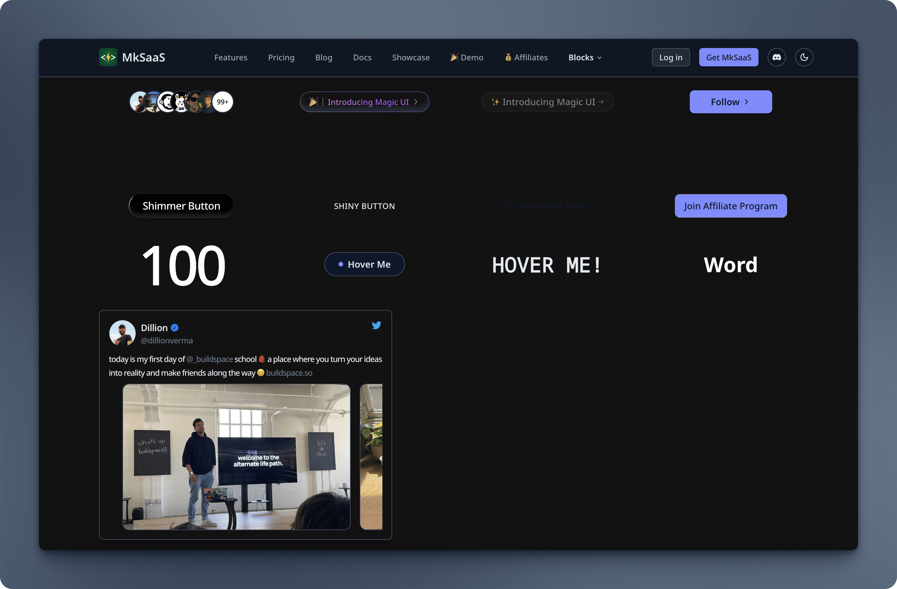
Magic UI Components
The src/components/magicui directory contains specialized UI components with advanced animations and interactions.
Some tips for using the Magic UI components:
- Do not modify components in the
src/components/magicuidirectory. - Avoid modifying these components as they are synchronized with official updates.
- These components are regularly synchronized with the official magicui releases.
- The
src/components/magicuidirectory is excluded from Biome linting and formatting.
Available Components
The src/components/magicui directory includes:
| Category | Components | Description |
|---|---|---|
| Text Effects | Animated Gradient Text | Text with animated gradient |
| Morphing Text | Text morphing animation | |
| Sparkles Text | Text with sparkle effects | |
| Word Rotate | Rotating word animation | |
| Hyper Text | Interactive text effects | |
| Text Animate | Text animation | |
| Typing Animation | Typewriter effect | |
| Interactive Elements | Animated Beam | Animated beam effect |
| Border Beam | Border animation | |
| Pulsating Button | Button with pulse effect | |
| Shimmer Button | Button with shimmer | |
| Rainbow Button | Rainbow effect button | |
| Ripple Button | Button with ripple | |
| Shiny Button | Button with shine | |
| Layout Components | Magic Card | Interactive card |
| Animated Grid Pattern | Animated grid background | |
| Bento Grid | Bento box layout | |
| Marquee | Scrolling content | |
| Hero Video Dialog | Video modal | |
| Blur Fade | Reveal animation | |
| Special Effects | Confetti | Confetti animation |
| Meteors | Meteor effect | |
| Blur Fade | Blur transition | |
| Ripple | Ripple effect | |
| Dot Pattern | Dot background | |
| Grid Pattern | Grid background |
You can find some of the Magic UI components embedded in the MkSaaS template in the Magic UI Components page.
Animate UI Components
The src/components/animate-ui directory contains a collection of animated UI components designed for modern, dynamic interfaces. These components are modular and can be used to enhance interactivity and visual appeal in your application.
Some tips for using the Animate UI components:
- Do not modify components in the
src/components/animate-uidirectory. - Avoid modifying these components as they are synchronized with official updates.
- These components are regularly synchronized with the official Animate UI releases.
- The
src/components/animate-uidirectory is excluded from Biome linting and formatting.
Available Components
The src/components/animate-ui directory includes:
| Category | Components | Description |
|---|---|---|
| Text Animations | Typing Text | Typewriter-style animated text |
| Counting Number | Animated number counting effect | |
| Gradient Text | Text with animated gradient | |
| Highlight Text | Animated text highlight effect | |
| Sliding Number | Number sliding animation | |
| UI Elements | Playful Todolist | Animated interactive todo list |
| Buttons | Ripple Button | Button with ripple animation |
| Copy Button | Button with copy-to-clipboard animation | |
| Flip Button | Button with flip animation | |
| GitHub Stars Button | Animated GitHub stars button | |
| Icon Button | Animated icon button | |
| Liquid Button | Button with liquid animation effect | |
| Effects | Motion Effect | General motion effect wrapper |
| Motion Highlight | Motion highlight effect for interactive elements | |
| Components | Code Editor | Animated code editor component |
| Radix UI | Checkbox | Animated checkbox based on Radix UI |
| Backgrounds | Hexagon Background | Animated hexagon background |
| Hole Background | Animated hole background effect | |
| Stars Background | Animated stars background | |
| Bubble Background | Animated bubble background | |
| Gradient Background | Animated gradient background | |
| Base | Progress | Animated progress indicator |
DiceUI Components
The src/components/diceui directory contains a collection of DiceUI components designed for modern, dynamic interfaces. These components are modular and can be used to enhance interactivity and visual appeal in your application.
Some tips for using the DiceUI components:
- Do not modify components in the
src/components/diceuidirectory. - Avoid modifying these components as they are synchronized with official updates.
- These components are regularly synchronized with the official DiceUI releases.
- The
src/components/diceuidirectory is excluded from Biome linting and formatting.
Available Components
The src/components/diceui directory includes:
| Category | Components | Description |
|---|---|---|
| UI Elements | Kanban | Kanban board |
You can find the Kanban component embedded in the MkSaaS template in the Roadmap page.
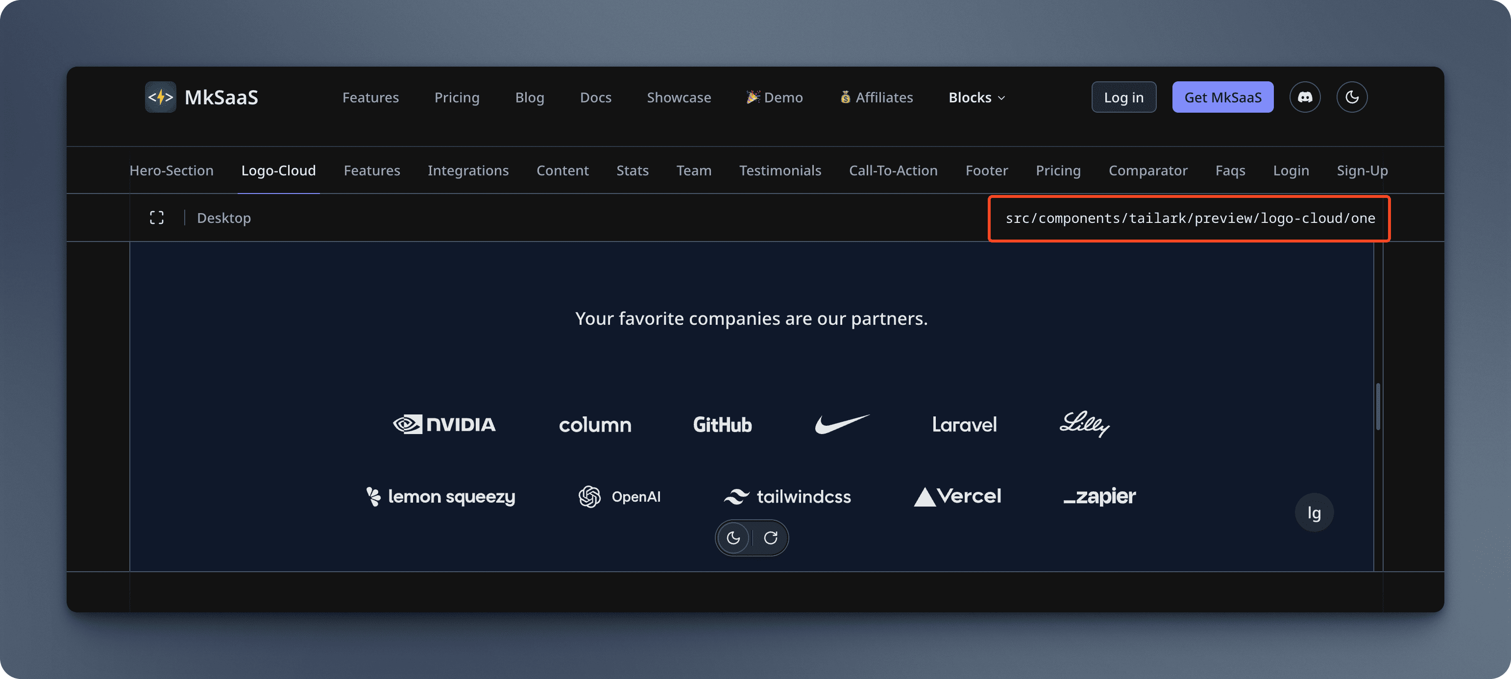
Tailark Marketing Blocks
Tailark marketing blocks are located in the src/components/tailark directory.
Some tips for using the Tailark components:
- Do not modify components in the
src/components/tailarkdirectory. - Avoid modifying these components as they are synchronized with official updates.
- These components are regularly synchronized with the official tailark releases.
- The
src/components/tailarkdirectory is excluded from Biome linting and formatting.
Available Blocks
The Tailark directories include:
| Category | Description |
|---|---|
| Hero Sections | Engaging, attention-grabbing page headers |
| Logo Cloud | Display partner or client logos |
| Features | Highlight your product's key capabilities |
| Integrations | Showcase third-party integrations |
| Content | General content display sections |
| Stats | Display important metrics and statistics |
| Team | Present your team members |
| Testimonials | Display customer reviews and testimonials |
| Call-to-action | Encourage user actions |
| Footer | Page footers with links and information |
| Pricing | Showcase your pricing plans |
| Comparator | Compare different product features or plans |
| FAQs | Answer common questions |
| Login | Login related components |
| Sign-up | Sign-up related components |
| Forgot Password | Password recovery interfaces |
| Contact | Contact forms and information |
You can find all the blocks embedded in the MkSaaS template in the Tailark Blocks page, and you can get the component file path on the top right corner of the block preview.
Business Components
Business-specific components are organized in dedicated directories under src/components. Each module has its own directory:
Adding Custom Components
When adding new components to your project:
- Choose the Right Location: Place components in the appropriate business module directory
- Follow Naming Conventions: Use descriptive, PascalCase names for components
- Maintain Consistency: Follow the existing component structure and patterns
Example of adding a new component:
// src/components/dashboard/AnalyticsChart.tsx
import { Card } from "@/components/ui/card"
import { Chart } from "@/components/ui/chart"

export function AnalyticsChart() {
  return (
    <Card>
      <Chart data={...} />
    </Card>
  )
}
References
Video Tutorial
Next Steps
Now that you understand how to use components in MkSaaS, you might want to explore these related topics: